Challange
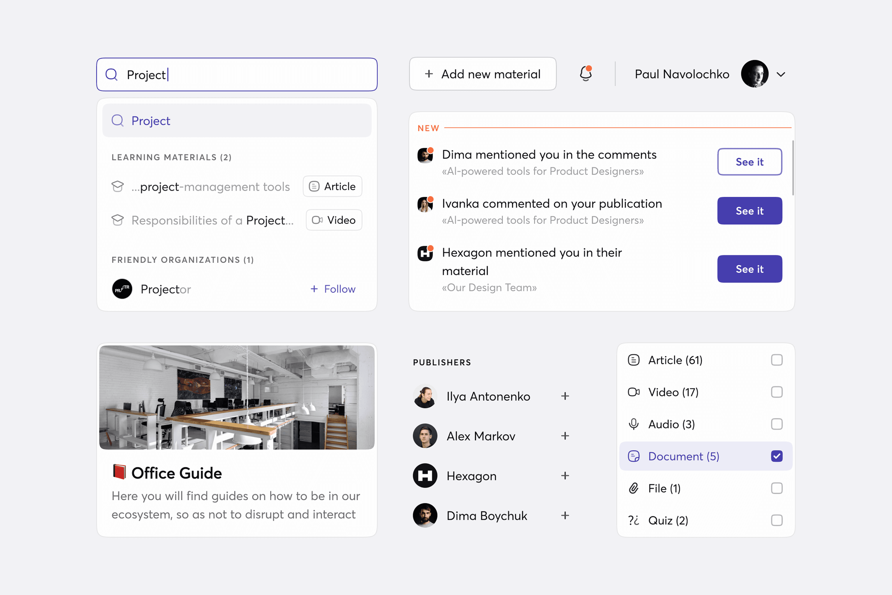
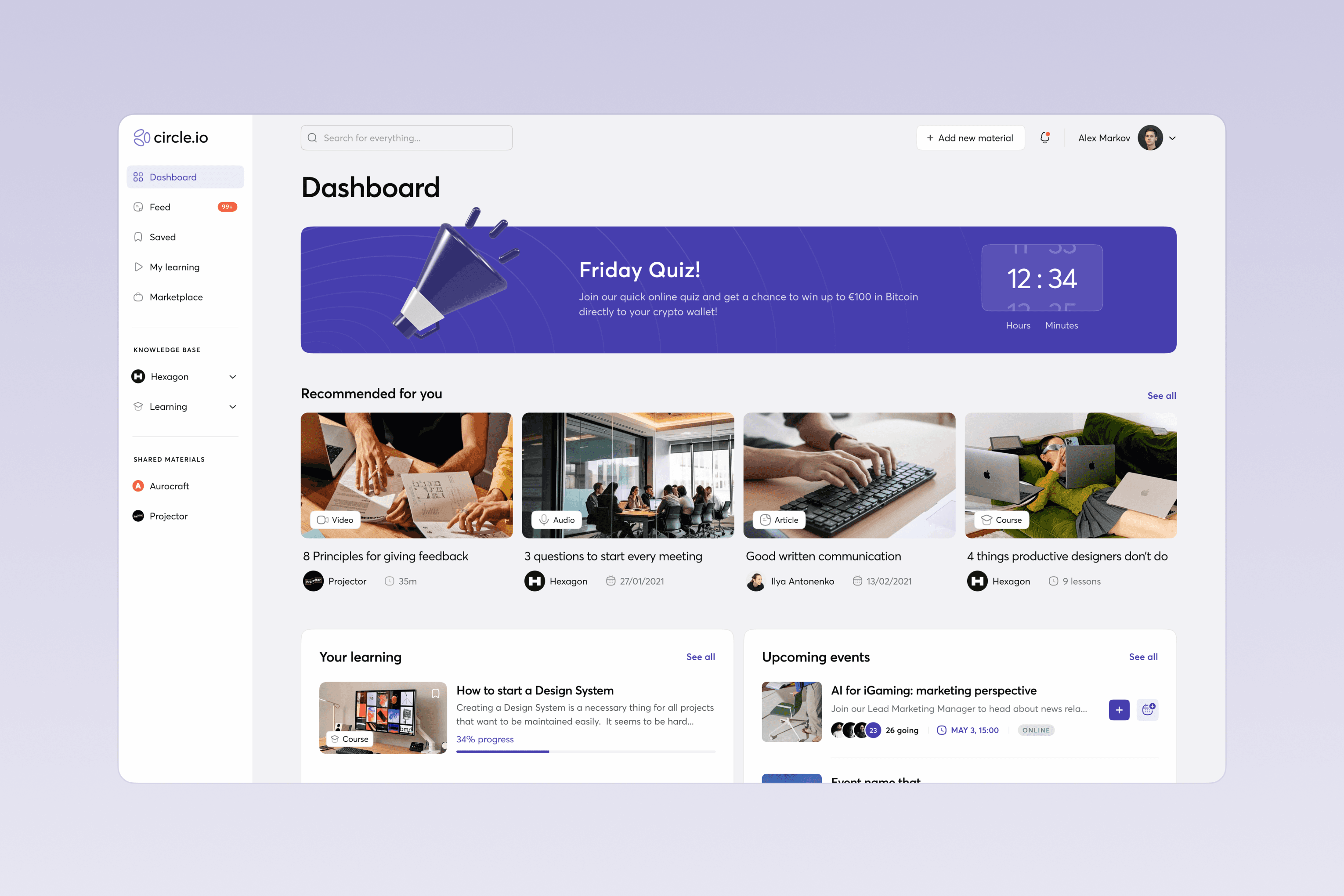
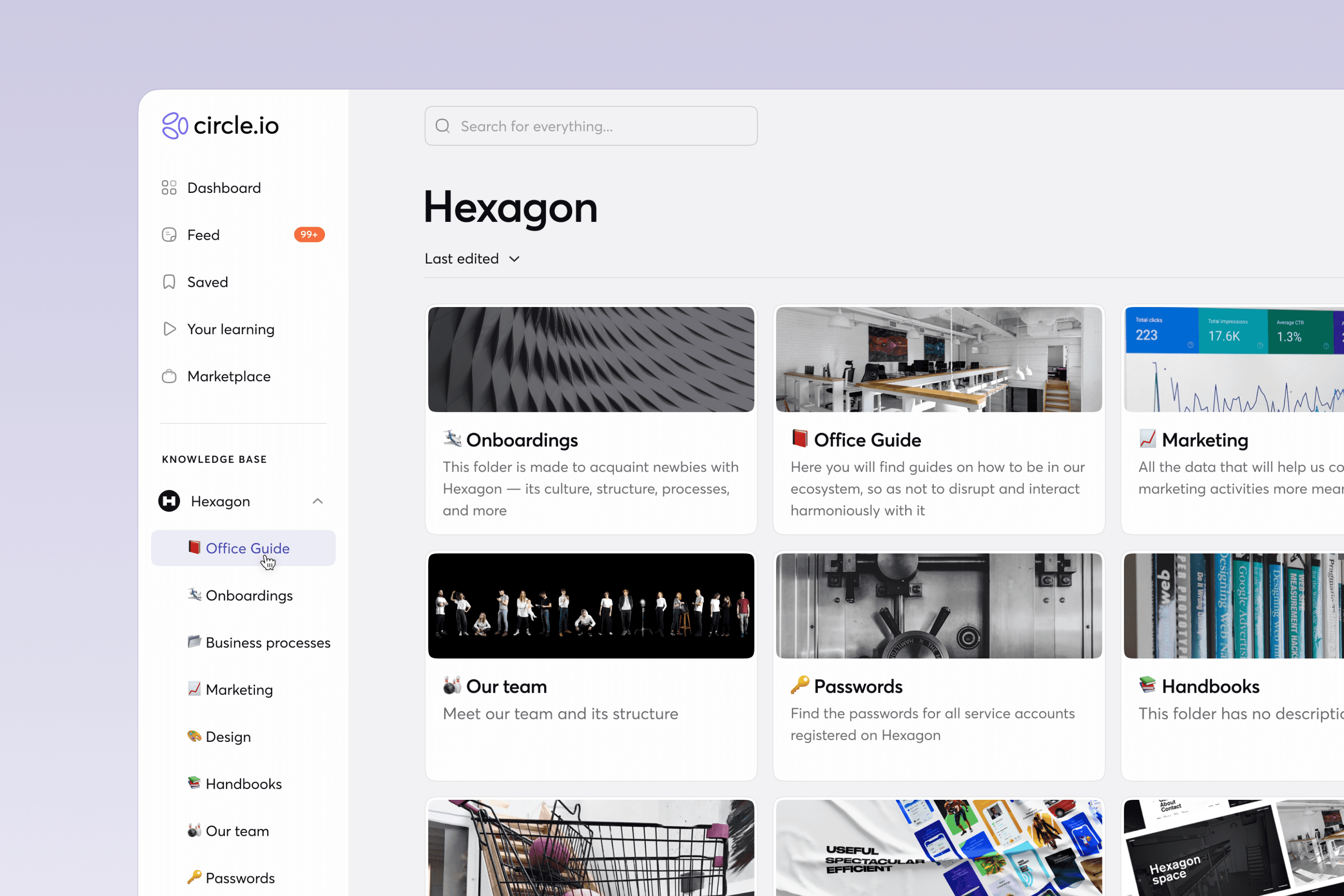
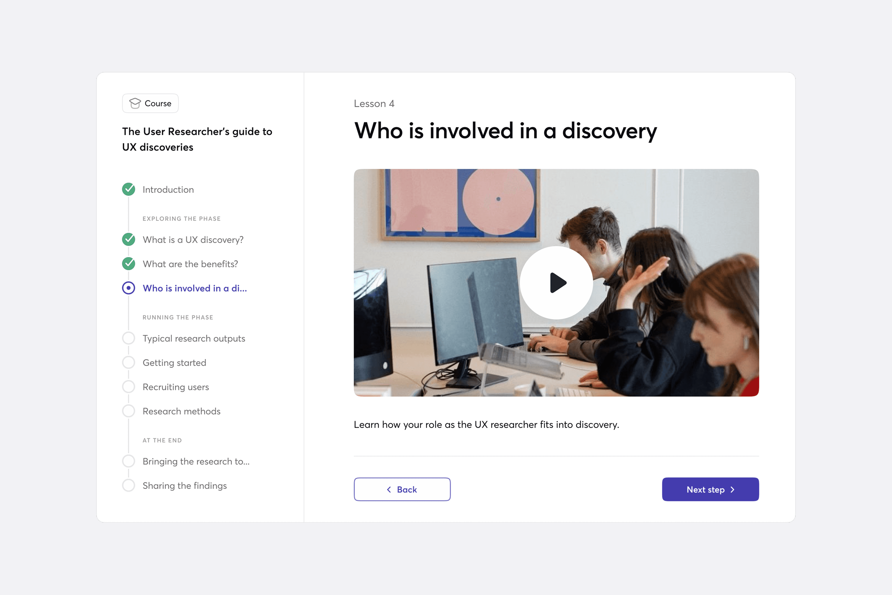
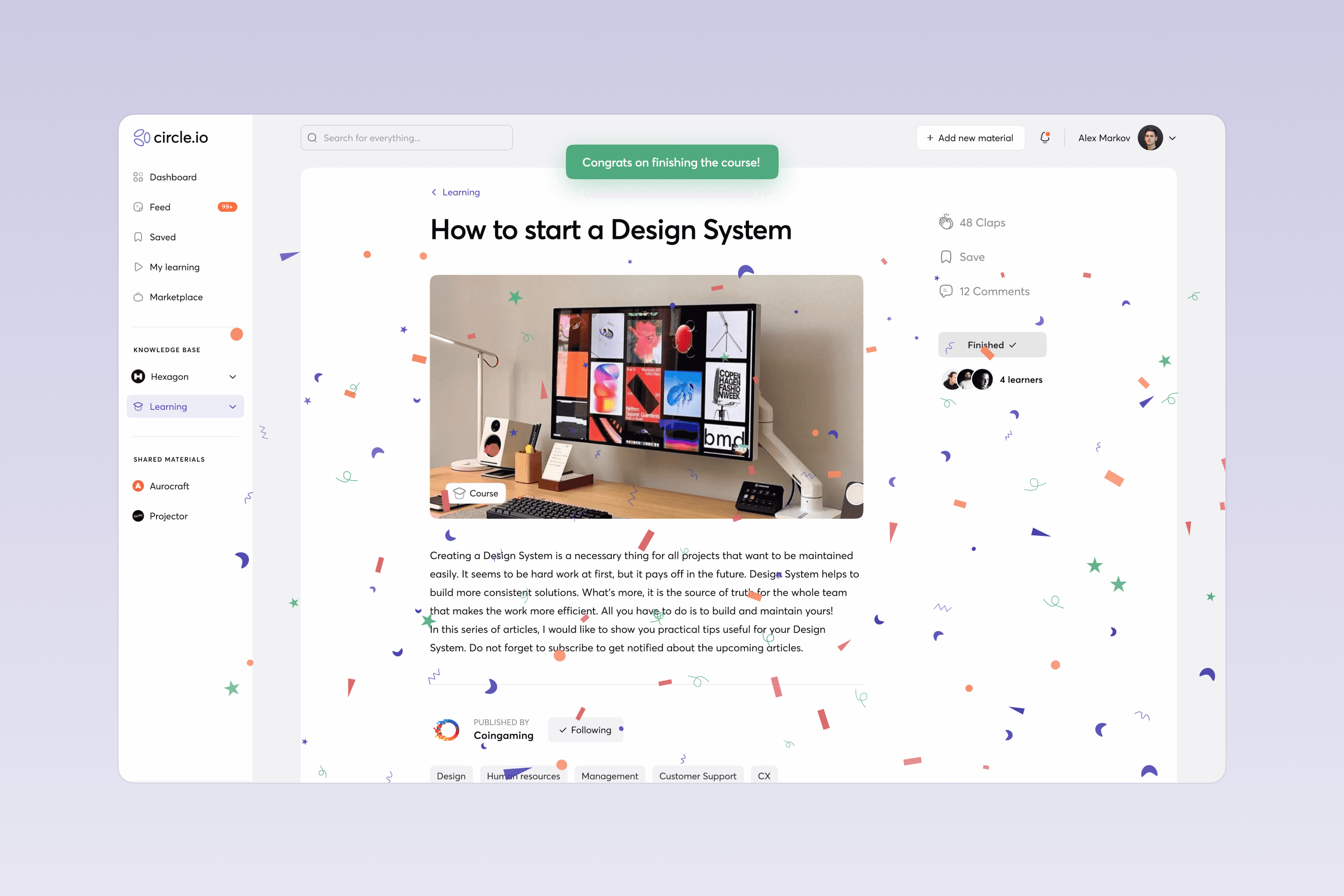
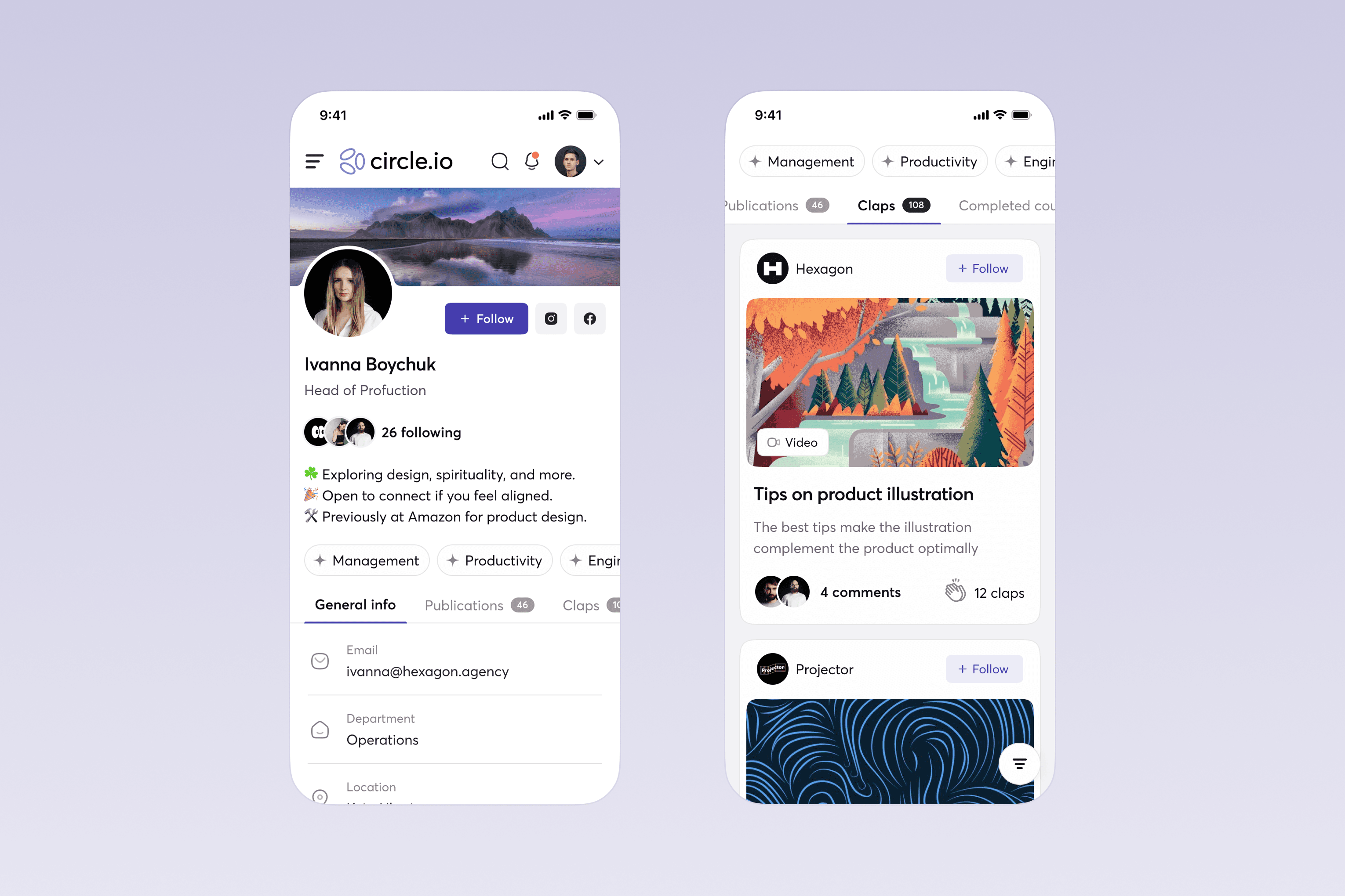
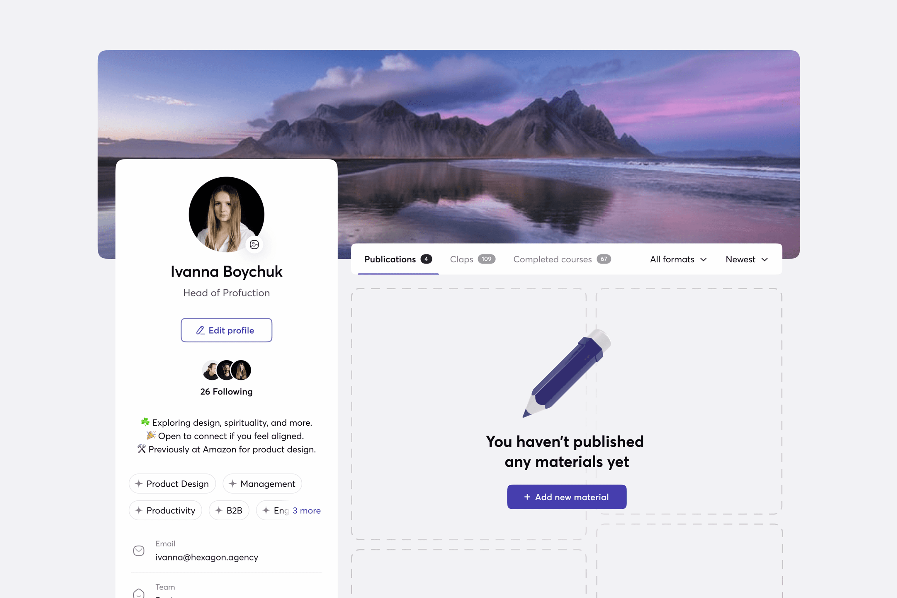
An AI-based knowledge base and training tool for companies and their coworkers made to amplify the corporate culture of knowledge sharing and professional learning. It’s like the multi-functional social network made up of tools for databases and documentation management, media, and learning experience, which allows creating and storing a variety of content, including courses for internal use.
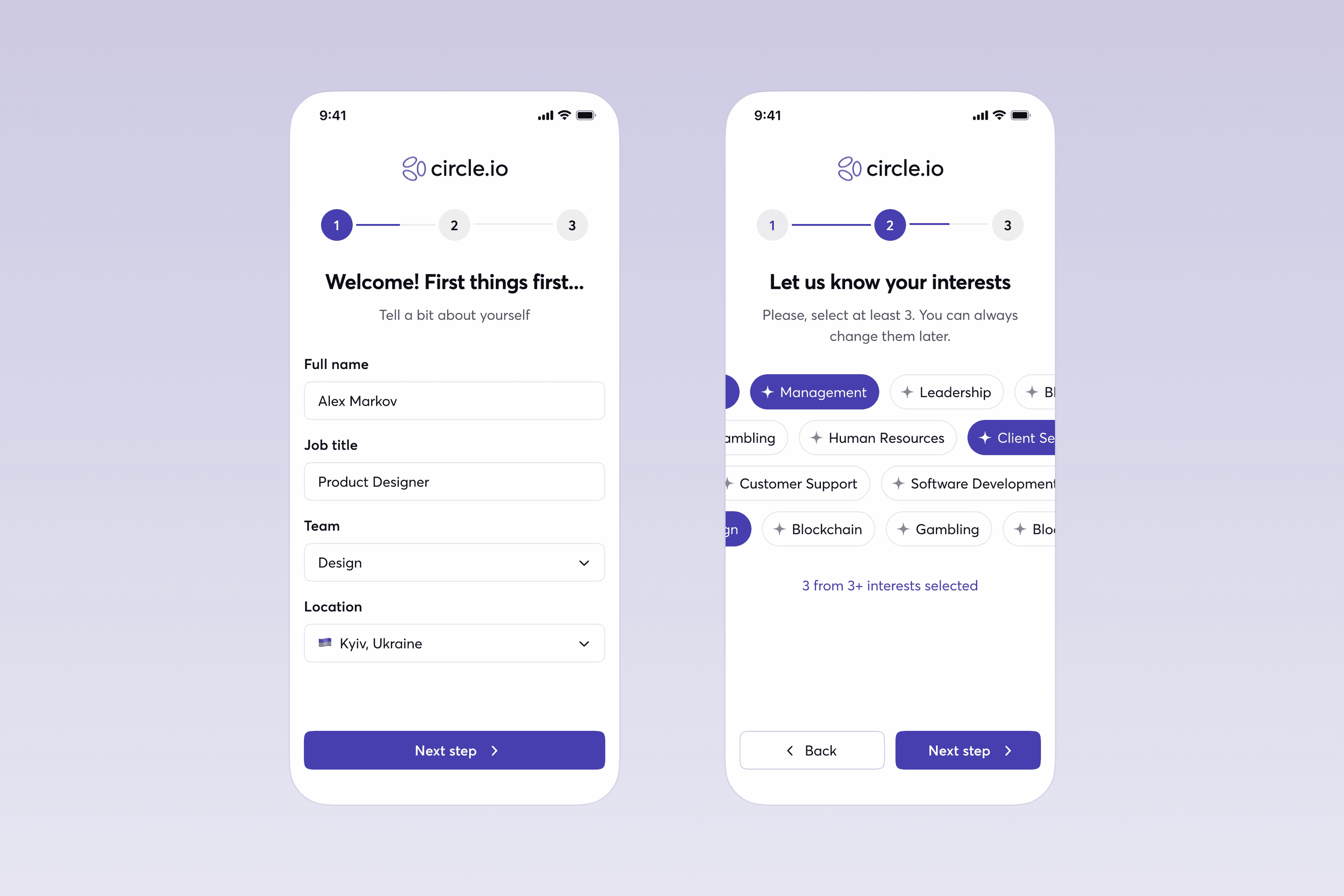
My role was to lead the design process, take ownership of the product, shape the product vision, ideate and design core features to deliver an exceptional user experience and design quality.
Services
Product Design
UX Research
User Interview
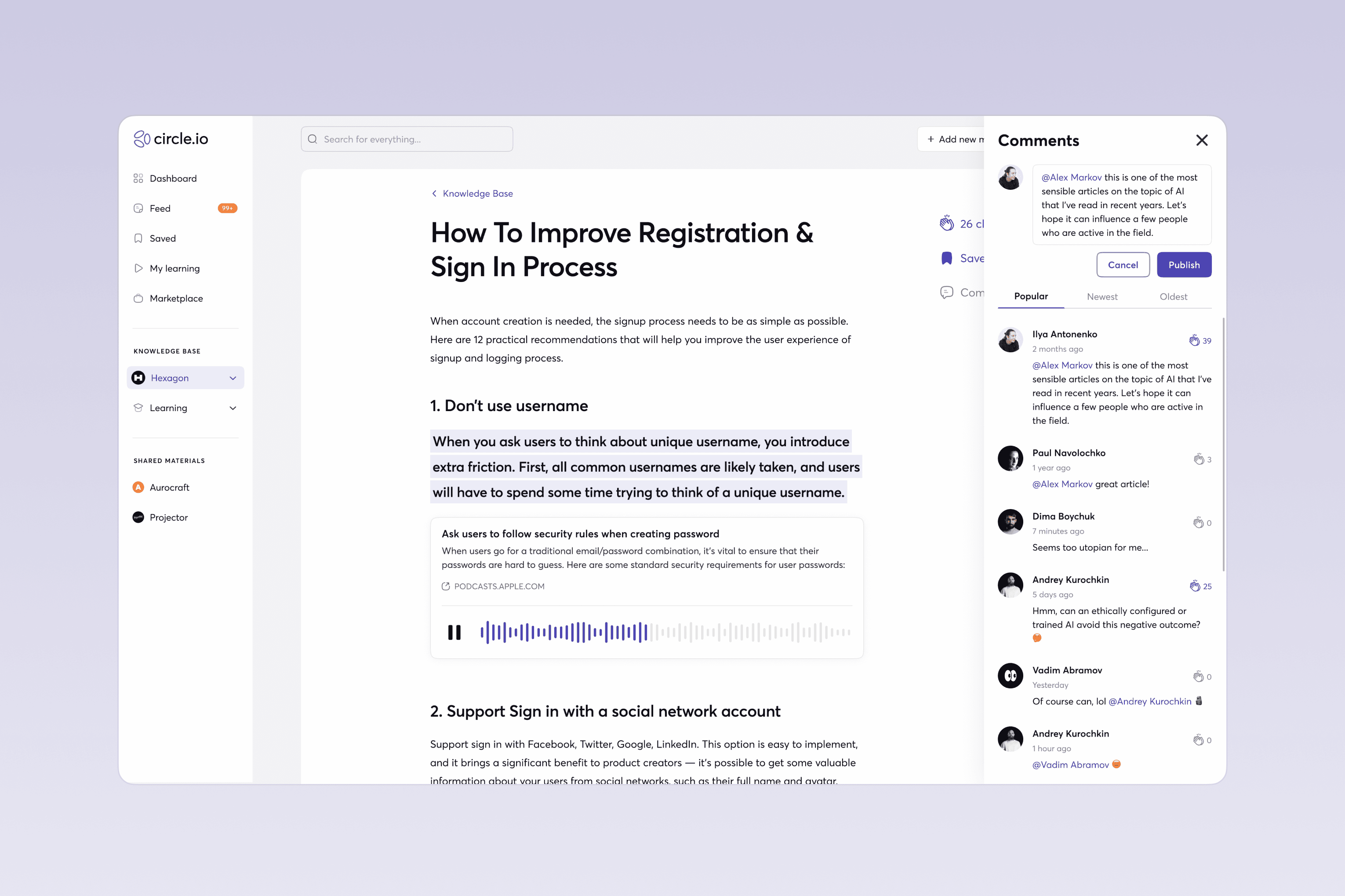
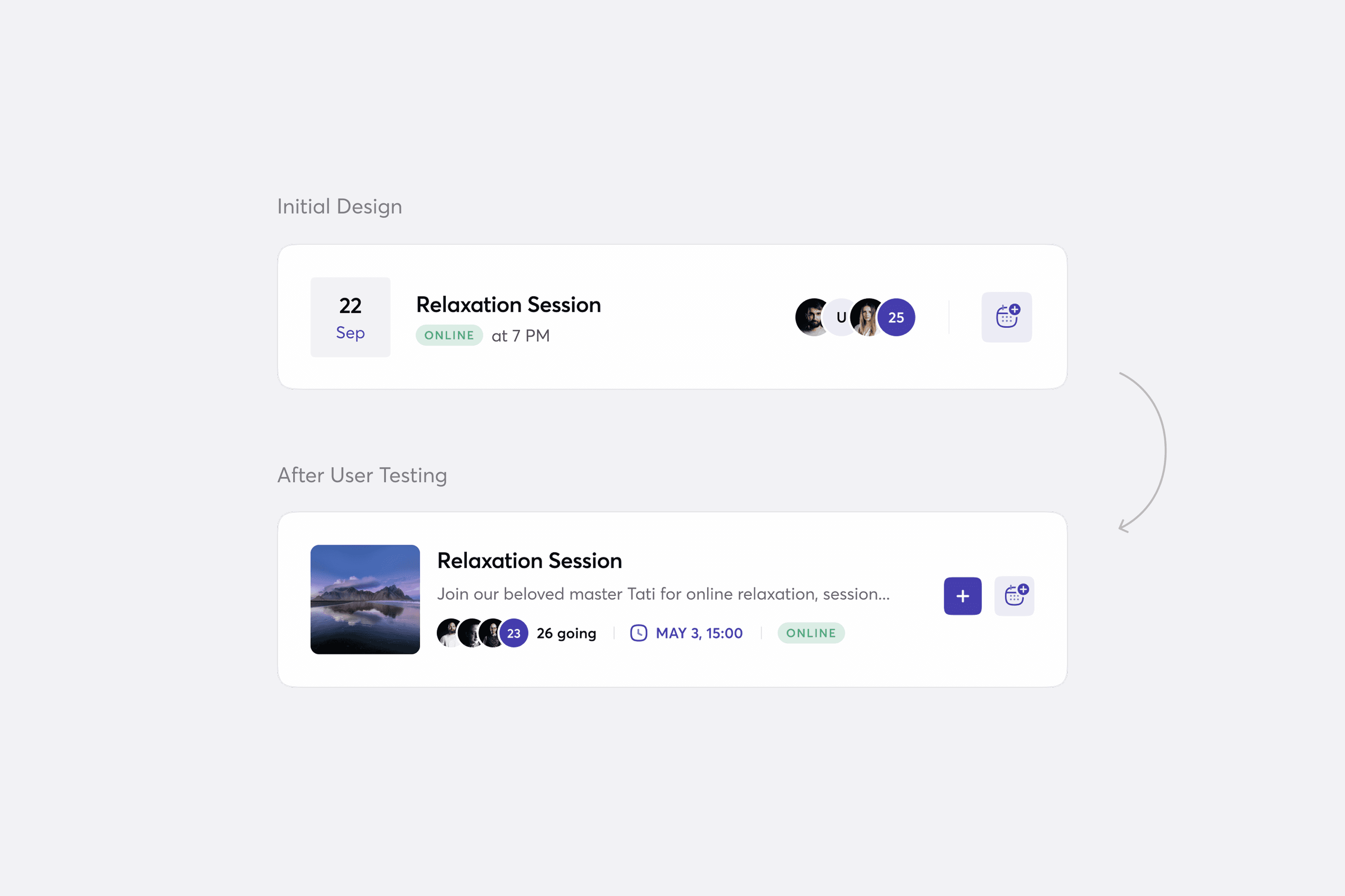
User Testing
Responsive Design
Wireframing
Prototyping
Design Systems
Discovery & UX Research
Stakeholder interviews provided an initial briefing on the project and clarified the client’s vision for the final product.
User interviews and testing helped uncover users’ thoughts, feelings, pain points, and real behaviors within the current system.
A competitor analysis was conducted to understand how similar products address the same problems and what features they offer.
main goals
problems to solve
After difining goals and problems we created Features Scope, Information Architecture, Main Use Cases and Wireframes.